The Contexts window switcher
Jul 20, 2016I’m at the end of a trial of Contexts an interesting window switching app for macOS (ooh, new style naming!), and I’m enjoying using it so decided to write a review.
From its homepage, the core idea of Contexts is to improve Command + Tab
functionality and make it a lot more flexible. In my view it definitely
succeeds on both counts, but at the expense of being a little confusing, and
maybe having a few too many features.
Features
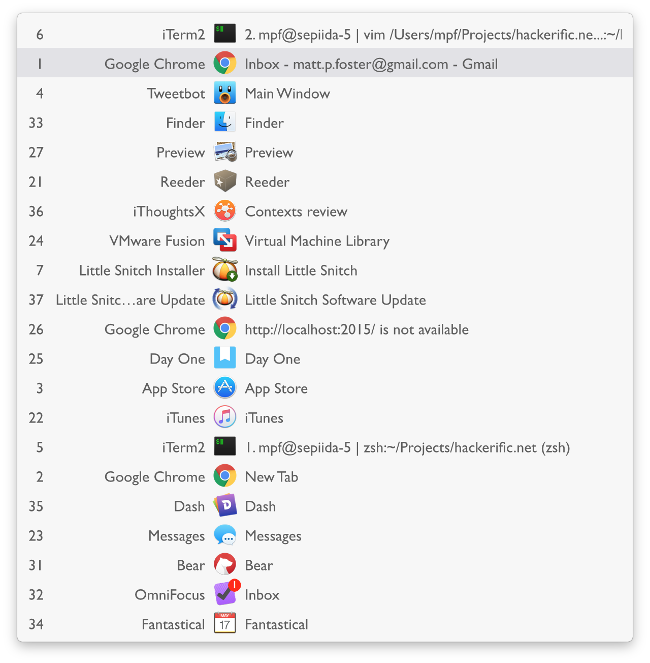
First, I think the main Command + Tab functionality is great, a quick press
behaves exactly as before, but hold down on the keys and up pops a panel. This works
exactly as you’d expect, so you can move the highlighted windows with the
cursor keys, keep tabbing back and forward, or, if you’re feeling adventurous
you can type the number next to the window you want to switch to it faster.
The fact that you can select by number is clearly aimed at keyboard lovers, but in practice I don’t really use it, as I tend to tab through window lists.

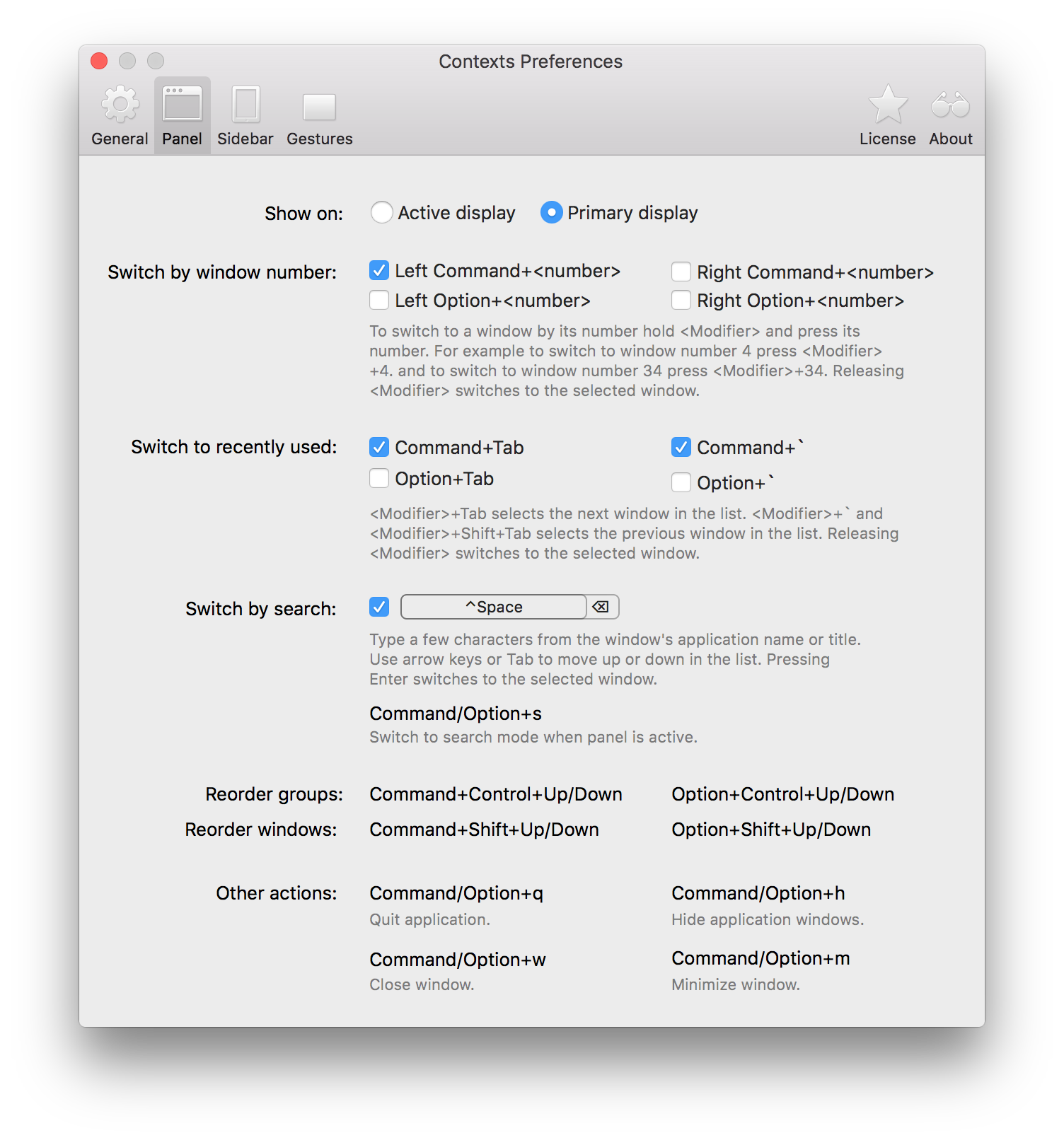
One of my main UI hangups is here, in this panel. By default, Contexts binds
the keyboard shortcut Command + ` to move the down the window list, which
makes sense, as it’s easier to type than Command + Shift + Tab, but it
hijacks a shortcut I use all the time.
By default, Command + ` switches between the windows belonging to a single
app. So, for example, if I had multiple Chrome windows open, as I often do, I
could switch between them my repeatedly pressing the shortcut. Now though, I
have to read the list, find the Chrome window I want, and then tab to it. This
is made a bit more difficult because Context’s window list reorders itself to
keep the most frequently used windows at the top. Luckily there are plenty of
other keyboard shortcuts you can use instead, as you can see in the preferences
pane.

On its own, the main list interface probably wouldn’t be worth paying for, but
Contexts search functionality really adds value. By default this was bound
to the shortcut I use for Launchbar Option + Space, but that was easily
changed, so now, when I press Ctrl + Space, I see this awesome search box:

As you can see, typing window names filters the list, and as with the main
switcher there are numbers you can use to jump to them (for example, typing
Command + 2 would jump to iTunes in my example). It’s cool, and actually
pretty useful.
Another interesting feature is Contexts’ side panel, which you activate by dragging your finger vertically along the side of your trackpad. Doing this makes it pop out, and show a narrow version of the window list (although you can change this to the full list). Dragging down the side of the pad selects between the listed windows, although in practice I found that I could only reach the top 70% or so of the list because my trackpad isn’t big enough!

Finally
Overall, Contexts is a really interesting app, and I’m probably going to pay for it. I’m still not entirely sure about some of the features, and there are more I’ve not mentioned, but it’s still quick and simple to use, and some things like searching are cool.
If you already use an application launcher, like Launchbar, you can probably do some of what Contexts does natively, see this, for example. This doesn’t seem to list individual windows, but still makes a nifty application switcher.
Contexts is currently priced £7.07, so probably $10 in post-brexit UK. I’d say its worth a look.
