Programming ligatures
Nov 13, 2016Programming ligatures are font glyphs designed to improve the readability of code. If you spend a lot of time staring at a terminals or text editors you might* find that ligatures can hugely decrease the time it takes you to read, understand and locate code, which if you’re doing any kind of maintenance work is awesome. (*I say “might” above because I’m not aware of evidence, but I’m also not aware of any studies.)
Until I’d heard about programming ligatures I’d never really thought much about improving code readability, aside from selecting a nice font and coupling it with a decent terminal colour scheme. Then I read about the FiraCode font and iTerm2’s pending support and gave it a try.
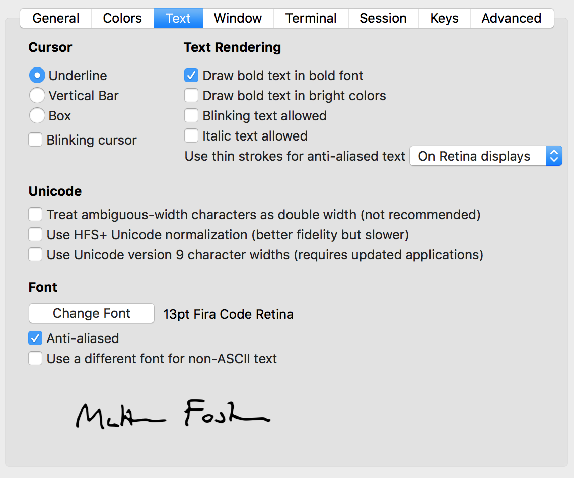
Support isn’t amazing, but it’s getting there, so a number of apps now support ligatures and trying them out is easy. If you use iTerm2 nightly builds you already have support, just download a font with the correct glyphs and add it to a profile:

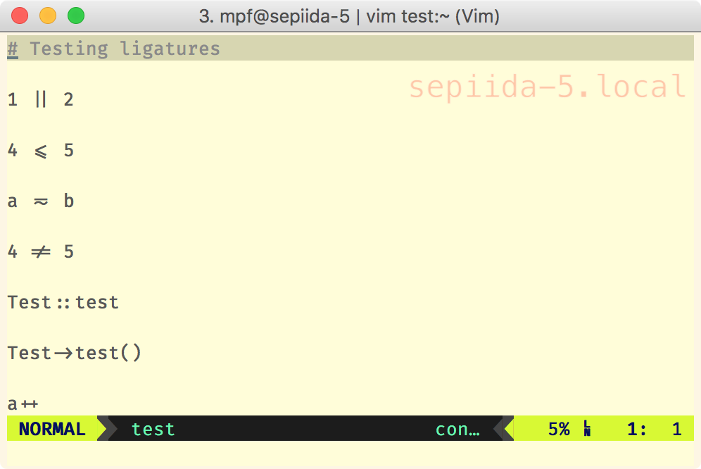
Then you could find that if you view text like this:
# Testing ligatures

1 || 2

4 <= 5

a =~ b

4 != 5

Test::test

Test->test()

a++
It’ll render like this:

You can also configure other apps, such as TextMate and Atom to do the same. The best list of supported software I’ve found is FiraCode’s, although it’s also worth noting that iTerm2 support is pretty much spot on in nightly builds (as of November 2016), as you can see above.
If you don’t want to make any config changes there’s also a handy website,
http://app.programmingfonts.org/, where you can select various programming fonts
from a list and see how they look on the right. Pick FiraCode from the dropdown
to see it in action (you might need to type some more operators, like ~=, !=
or === to see it properly).
While the changes seem pretty minimal you should find after using them for a while that they really help. You should also find when you copy and paste that you actually copy the underlying glyphs, rather than the ligatures, so that’s pretty helpful too. I’m looking forward to seeing improved support, and maybe some more fonts too!
