Simple Weather Graphs
Jan 24, 2016In the beginning of 2013 I bought myself a Maplin USB Weather Station. Like lots of things in Maplin, it’s produced by an OEM and then rebranded, and in this case the unit is a Fine Offset WH1081, it consists of a pole which is stuck in the garden, and a ‘touch screen’ display and wireless reader.
My original plan was to work out how to sniff the wireless signals from the external unit and directly read the data, but despite playing about with exactly that, and despite plenty of evidence that it is possible I never got anywhere.
Anyway, after a while I decided to see what I could get over the USB port, and I quickly discovered the pywws project, which I downloaded and installed on a Raspberry Pi. It’s a well known fact that you can’t own to many Pis!
pywws is a fairly complex piece of software which can, among other things, produce graphs for you, but when I saw how complicated configuring it was I decided to hand roll something. My solution looks like this:
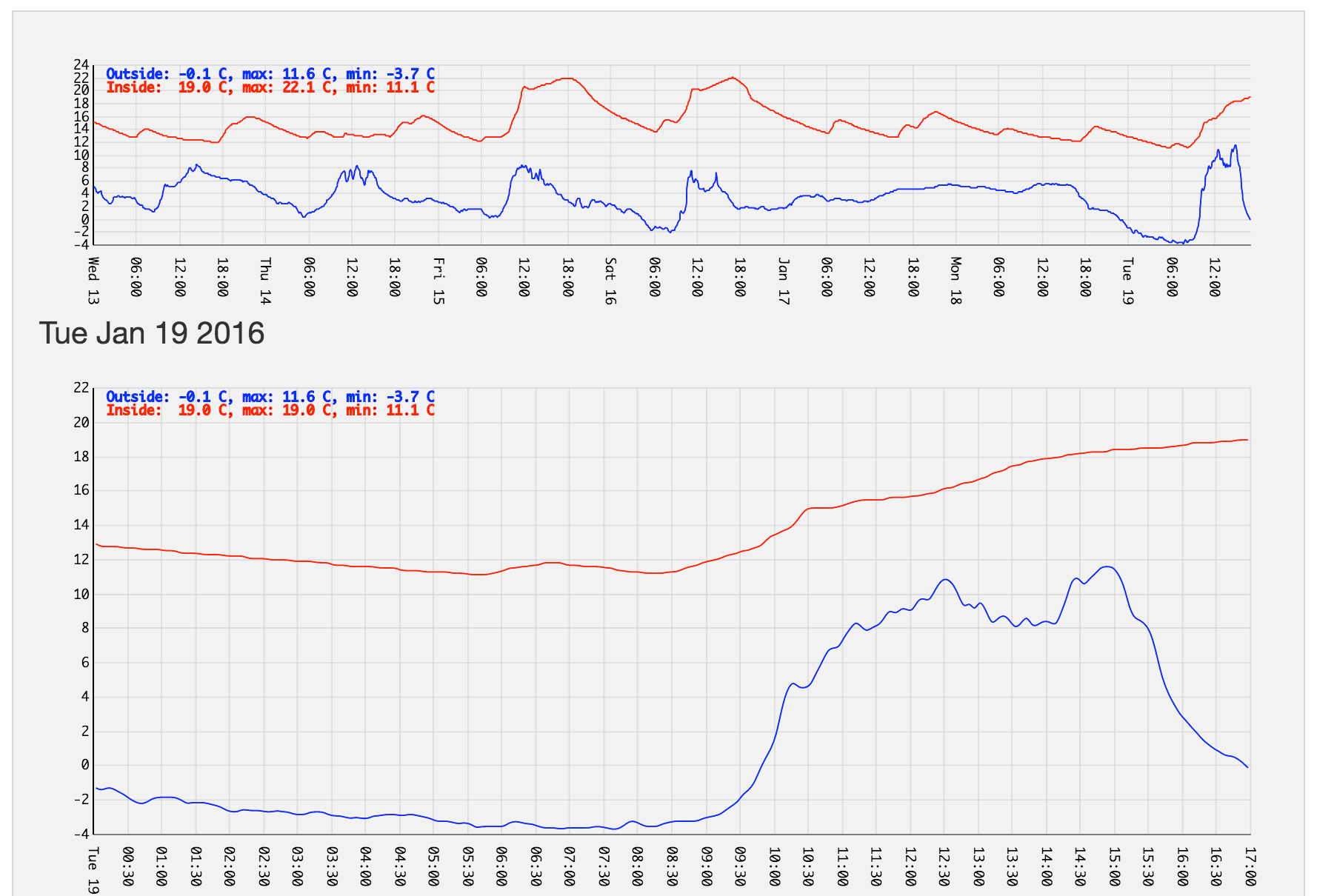
The rest of this post describes how I make those graphs, using the hardware, the pi, and d3.
The setup
I have pywws on a raspberry pi model B, and the USB cable from the weather station plugged into it.
On the Pi, I keep pywws-livelog -vvv /home/pi/weather/data running. This
grabs weather data and stores it in ~pi/weather/data.
I use a cron job and SSH with a passwordless key (yes, I’m bad, and you can configure pywws to do these things for you), to copy the contents of this directory to my web server every few minutes, and I end up with lots of files that look like this:
    2016-01-19 00:02:01,5,63,12.9,83,-1.3,1007.3,0.0,0.0,4,794.1,0
    2016-01-19 00:07:01,5,63,12.8,82,-1.4,1007.5,0.0,0.0,4,794.1,0
    2016-01-19 00:12:01,5,63,12.8,82,-1.3,1007.6,0.0,0.0,2,794.1,0
    2016-01-19 00:17:01,5,63,12.8,82,-1.3,1007.4,0.0,0.0,2,794.1,0
    2016-01-19 00:22:01,5,63,12.8,82,-1.5,1007.4,0.0,0.0,2,794.1,0
    2016-01-19 00:27:01,5,63,12.7,82,-1.7,1007.4,0.0,0.0,2,794.1,0
    2016-01-19 00:32:01,5,63,12.7,82,-1.9,1007.4,0.0,0.0,2,794.1,0
    2016-01-19 00:37:01,5,63,12.7,78,-2.1,1007.3,0.0,0.0,2,794.1,0
This format of these files is described in the online documentation, but includes various useful things like:
- The time stamp,
- The device index (not useful to me)
- The interior humidity
- The interior temperature
- The exterior humidity
- The exterior temperature
- The absolute pressure (not calibrated)
It can also measure wind speed and direction and rainfall rate, but I’ve not yet got around to using these – I totally should.
The software
I opted to start with displaying only temperature data, because I’m lazy, and decided to use d3 because it’s flexible and fun, despite a steep learning curve.
The guts of my graphs live in two files: weather.js and timeseries_line.
weather.js
This file defines graph sizes, custom time formats for x-axis labels and grabs the text files I mentioned above using AJAX requests. It grabs several days worth of data and parses them into a format d3 can use.
timeseries_line.js
This file does the drawing. Based on this post I tried to abstract most of the settings out of the file and make it reusable, but didn’t really succeed (or spend long enough trying). When I add pressure and humidity graphs I’ll probably update this.
In combination
Together, these files and the Foundation
framework form the full dashboard. When you load the page the scripts load up,
grab the last 6 days of weather data, join it all up and create the top plot,
and then add divs to create the rest. The result is as shown above, and is
currently visible at
graphs.hackerific.net/weather.html.
Future stuff
I’d like to make this more of a dashboard style thing, and to graph some of the other data I have from the station, especially pressure and humidity. Also, I still like the idea of pulling the data from the station wirelessly, so may give that another try at some point. Let me know if you’d like to see the code put on github.